In her October
budget the Chancellor raised total government spending by 1.8% of GDP
compared to the plans of her predecessors, which means that total
public spending as a ratio to GDP stays pretty flat over the 5 year
forecast period. (Anyone who calls this the share of government
spending in GDP is either being sloppy or deliberately misleading.
[1]) As a result, that ratio is planned in 2029/30 to be roughly
where it was in 2022/3, the penultimate financial year of the
Conservative government.
Just before the
budget, I calculated that spending to GDP needed to be about 3%
higher than this to ‘end austerity’, by which I meant return public service provision to a level similar to the final
years of the last Labour government. However the method I used to get
to that figure was based on some unfamiliar data sources, so I thought it
might be useful to redo that calculation using more familiar
definitions. This post does that.
What you cannot do,
but which so many do, is look at the total ratio of government
spending to GDP and draw conclusions from that alone. Invariably such
exercises equate a constant level of this ratio over time with a
constant provision of public services, but this is completely wrong.
For example, total government spending includes the interest the
government pays on its debt, but it would be silly to suggest that
the public services have improved since the pandemic because interest
rates on that debt have significantly increased. The ratio of total
public spending to GDP was unchanged between 2007/8 and 2016/17, and
as a result I still get some people telling me that therefore
austerity over this period was a myth. Clearly we need to look at
some level of disaggregation.
Before I do so, it
is worth noting that it isn’t easy to get hold of historical time
series that break down the public spending total into its components,
including how much each department has received over time. The ONS do
publish a quite detailed breakdown by spending
function, but for individual years rather than as a time series.
Thankfully the IFS has done much of the legwork here,
and I’ll draw on this source extensively. Those who want to avoid
my analysis and jump to my conclusions can skip to the text after the
final table.
Even if we
disaggregate total spending into its major components, it is still
true that keeping some part of public spending as a proportion of GDP
constant over time is not necessarily keeping the level of public
provision constant. This point can perhaps be made most clearly by
noting that as GDP grows the share of food purchases in total GDP
tends to fall, but it would be daft to report this as implying that
as economies grow people are getting hungrier. The two items of UK
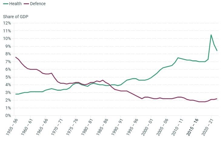
public spending that have shown the clearest trends in the past are
health and defence. Here, from the IFS document referenced above, are
those shares over time.

Defence spending is
now almost a quarter of what it was in 1955, reflecting both the
abandonment of the UK’s imperial role and the end of the cold war.
Obviously this does not mean people feel less secure than they used
to. Health spending as a share of GDP has been steadily going up over
time for a number of reasons. To the extent that this is because the
population is getting older and therefore needs more care, it does
not imply that we are on average healthier but just that life
expectancy has increased. A clear example of this point is that
during the decade after 2010 the share of health spending in GDP only
fell slightly, but waiting times for treatment increased much more
dramatically, correctly suggesting the level of public provision of
health services had deteriorated substantially.
The chart below
compares the public spending ratio with and without health and
defence spending, and they look quite similar. However this is
largely a coincidence, and critically the future looks very
different, because probably both ratios will need to rise in the
future. As a result, since the start of the century when defence
spending stopped falling, and for the foreseeable future, we should
expect to see the total public spending ratio (and therefore for the
share of total taxes in GDP) to rise over time. I apologise for going
on about this, but this basic point is hardly ever made in mediamacro
commentary.
Total UK public spending as a ratio of GDP including and excluding health and defence

Of course health and
defence are not the only areas of public spending where spending as a
share of GDP may rise or fall over time even though public provision
remains the same. Another example would be the implications of baby
booms for education spending. However the upward trend in health
spending is so substantial that some analysis is required. We cannot
just fit a trend line through the data, because for much of this
period health provision has been too low. Health spending is unlikely
to be too high very often because raising taxes to finance it is
painful, but Conservative governments since 1979 have squeezed
spending. For this blog post I’ve tried to get a handle on this by
looking at total (public and private) health spending in other
countries using OECD data.
In almost every OECD
country where data is available from the early 1970s there is a
pronounced upward trend in the GDP share. The trend varies across
countries as we would expect, but an average across 19 OECD countries
implies that health spending to GDP rose by 0.11% each year, with
roughly an equal number of countries above and below this figure.
(The UK number is 0.145%.) As the pressures leading to this ratio
rising are common across most countries, it seems reasonable to use
this 0.11% figure as a measure of the underlying trend in the health
to GDP share..
All that remains to
decide is when UK health spending was sufficient. I have chosen 2010,
because waiting times for treatment at this point were tolerably low.
This allows us to measure the spending gap in other years, and also
to project this trend forward in assessing the adequacy of future
plans. Of course this approach is very rough and ready. It may also
be possible to reduce this trend in the future by increasing the
amount of preventative care (see the discussion here),
but that is not going to happen when health is underfunded because
treatment will always get prioritised.

Finally I have used
data from the IFS to compare GDP shares and ratios across categories
of spending between 2007/8 and 2022/3. [2] The earlier year is a
useful reference point because it is before the recession that
followed the financial crisis (recessions tend to raise spending in
some areas) and is not affected by subsequent austerity. As I have
already noted, the current planned total spending ratio for 2029/30
is similar to 2022/3.
Components of public spending as a
share of GDP
|
|
|
|
|
|
|
|
|
|
|
|
|
|
|
|
|
|
|
|
|
|
|
|
|
|
|
|
|
|
|
|
|
|
|
|
|
|
|
|
|
|
|
|
|
|
|
|
The chart above
suggests health spending in 2022/3 was around 0.5% of GDP below what
it needs to be to replicate 2007/8 levels of provision. Actual
provision was undoubtedly worse in 2022/3 because of the hangover
from the pandemic. Hopefully that will have dissipated by 2029/30,
but equally the underlying upward trend in health spending will mean
that spending will need to rise by just over 0.5% between 2022/3 and
2029/30. On this account the total public spending total needs to be
1% higher in 2029/30 to replicate 2007/8 levels of spending on health
grounds alone.
Turning to
education, allowing for changing student numbers still suggests that
public provision in 2022/3 was significantly below 2007/8 levels.
This assessment seems to roughly correspond with media reports of
inadequate provision (see here
for example). Turning to other social security, levels
of deep poverty in 2022/3 were similar to 2007/8, but
spending has fallen, suggesting another significant fall in public
provision here. (The two child limit needs
to end, for example.) Current problems in the
provision of public order and long term care have been well
documented. (Here is a very recent IFS report on justice.) If we allow for a public spending gap worth around 0.5%
of GDP in each of these four sectors, then adding in health implies
we need the total public spending ratio to be 3% higher in 2029/30
than current plans to replicate the level of public spending
provision seen in the final years of the last Labour government. [4]
A 3% gap just
happens to be the same number I calculated before the Budget using a
rather different approach. Any increase in the defence spending share
needs to be added to that. This analysis
confirms that Labour’s spending plans remain substantially
inadequate if the aim is to return public provision to levels seen in
the final years of the last Labour government.
Of course current
plans only go five years ahead, and Labour may be in power for longer
than that. It was only in the second term of the previous Labour
government that public spending increased substantially. There are
various reasons why the political situation is similar and different
to then. My more substantive concern is that the Chancellor shows no
sign of having done the kind of analysis shown above, but I am happy
to be corrected (in confidence) if I am wrong about this. [5]
My analysis suggests
that repeating Labour’s commitments on the main areas of tax going
into the next election would be very foolish, but I fear the
political pressures to do so will be great, and that this government
will succumb to those pressures. There is a nasty feedback loop here.
The more public service provision fails to noticeably improve over
the next few years the more Labour will feel it needs to make
unrealistic pledges on tax to win the next election. One way of
avoiding that was to have increased taxes by more in the last Budget.
.
[1] Calling this
ratio a share implies that the rest of GDP is the non-government
share, but it’s not because total government spending includes
transfer payments.
[2] Data for
overseas aid is for 2021/2 rather than 2022/3.
[3] There are many
areas of public spending not included in this list. For example
summing each column gives 32.4% for 2007/8 compared to 40.3% for
total public spending. The total public spending ratio in 2022/3 was
44.8%. Compared to 2007/8 debt interest explains about half this
increase, but I would really like to know what explains the rest.
[4] The level of
debt interest in 2029/30 is expected to be only a little below 2022/3
levels, reflecting an assumption that interest rates will not fall
back to levels seen in the 2010s. If this does turn out to be the
case, higher debt interest should imply higher taxation rather than
lower public spending. There is no reason why higher interest rates
should shift voters preferences between publicly and privately
provided goods, so saying that other public spending should fall to
match higher debt interest is as absurd as saying spending on food
should fall by this amount. Higher taxes allows the cost of
additional debt interest to be spread across all areas of consumer
spending.
[5] Attitudes within
the Treasury, and in particular a belief that it is up to departments
to make the case for higher spending, do not help here. Such an
approach often precludes a common overall framework and leads to
outcomes that can have more to do with the character of individual
politicians than social needs and preferences.
Source link